Wednesday 8 December 2010

Finished A1 Poster.....

Done the unconventional way! I can't lie; my In design lectures confused me a little. But with a bit of patience and experimentation I got there in the end.
At first I wanted to lay my images out in the order they were took in to illustrate my progression throughout the month. But after trying this it didn't work, I found little patterns in my work i.e, I took 3 red tonal images 3 days in a row and they didn't sit well next to each other. 

Tuesday 7 December 2010

FINAL 28 PHOTO'S

INDISTINCT


Photo a day inspirations and updates

After reviewing my initial ideas of Obscure I came to the conclusion it was in fact that; too obscure! So many things fell into this title I found my outcomes to be too random. So I decided to hone in on an aspect of Obscure; Indistinct....

I also decided to tighten up my design ideas after having a session in Abobe Indesign, so i've decided to change all my images to square format.

Artists i've been looking to for inspiration and ideas;

Wolgang Tillmans


Christian Boltanski


Mark Rothko


Saul Leiter


I'm a fan of his selective, understated use of colour. He has a distinctive style, something i'm trying to discover, find and develop in my own work.
I also live how his photo's can be mistaken for paintings at a quick glance.


Blog Neglectfulness > Subsequent updates....

I've been straying from the use of my blog, forgetting to add inspirations and even missing out whole briefs! So i'm here this eve to fill in the gaps......

THE INTERPRETATION OF COLOUR WITHIN A LANDSCAPE

We were set this brief back in October!! I was given the season winter to interpret in my own creative manner.

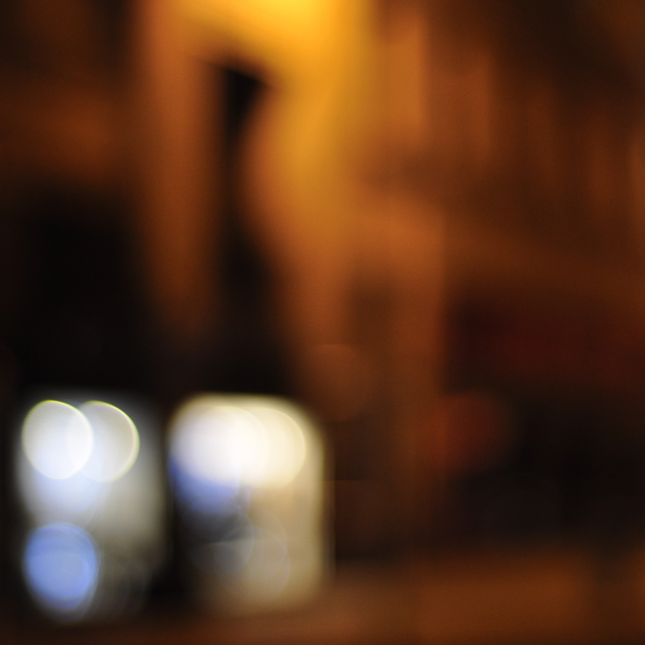
Below are my 6 final images;


The latter being my final submission image.

Whilst undergoing this project I first instinctively thought of cold, blue colours and the feeling of hostility. But then as I delved deeper I started to think of the social side of winter; wrapping up warm with your loved ones, preferably in front of a fire! This is where the use of red, warm, burning like colours came from. 

I think my final images shows a good contrast between the cold outer winter and the warm interior comforts.

Monday 22 November 2010

Design Layouts

Last week, I started thinking about the design layout of my 28 photo's. In order to fit in with my obscure theme I didn't want to set the images out in a regimented format, so I played with a few different layouts and this seemed to work the best... 

I like the black background, however not sure if we can use a colour block to outline our images??
I think this layout displays enough unity as far as design goes, but is also fitting with my theme.